Disclaimer: This post is for educational and informational purposes only and does not provide financial advice or investment guidance.
Introduction
Dashboards are a central component of most professional digital portals. They serve as the primary visual layer through which users interpret information, track progress, and understand system status. This article provides an educational overview of dashboard design in digital portals, focusing on layout principles, visual hierarchy, and information grouping. Platforms such as taxdome are referenced only as illustrative examples of dashboard organization, without any promotional intent.
The purpose of this post is to explain how dashboards are structured and why certain design choices are commonly used across digital portal environments.
The Purpose of a Dashboard in Digital Portals
A dashboard is designed to summarize information in a concise and readable format. Rather than presenting detailed content immediately, it provides an overview that helps users understand the current state of the system at a glance.
From an educational perspective, dashboards function as orientation tools. They highlight key sections, surface updates, and visually separate different types of information. This approach reduces the effort required to locate relevant content and supports efficient interaction with the portal.
In professional platforms, dashboards are informational by nature and focus on clarity rather than interaction or decision-making.
Common Dashboard Layout Structures
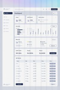
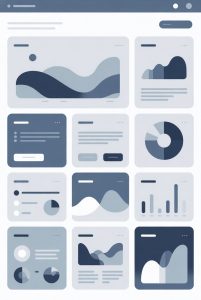
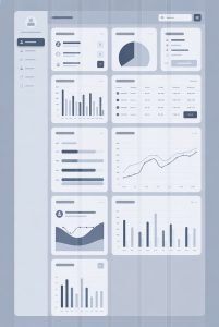
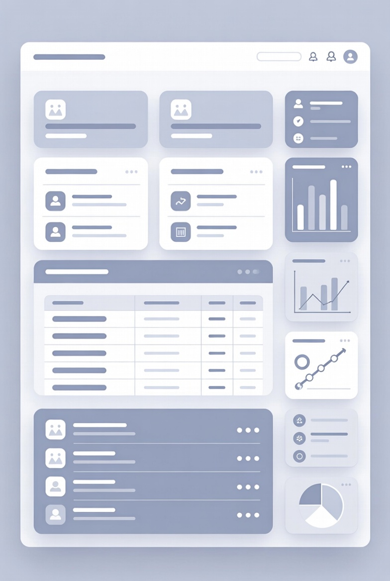
Most dashboards rely on a modular layout. Information is divided into blocks, often referred to as cards or panels, each dedicated to a specific category. These may include summaries, lists, or status indicators.
Grid-based layouts are especially common because they support visual balance and adaptability across screen sizes. In taxdome-style interfaces, dashboards often use symmetrical spacing and consistent alignment to maintain readability.
This modular approach allows dashboards to scale, meaning additional panels can be added without disrupting the overall structure.
Visual Hierarchy and Information Prioritization
Visual hierarchy is essential in dashboard design. It determines which elements draw attention first and how users scan the page. Size, color contrast, and placement are used to establish priority without requiring textual explanation.
Educational analysis shows that dashboards typically place the most general information at the top, with more specific details appearing lower on the screen. This top-down structure aligns with common reading patterns and supports quick comprehension.
Subtle visual cues, such as shading or borders, help separate content areas while maintaining a cohesive appearance.
Use of Icons, Labels, and Indicators
Icons and labels are used to support recognition rather than interpretation. Well-designed dashboards rely on familiar symbols and clear terminology to minimize ambiguity.
Status indicators, such as progress markers or visual tags, are often included to provide contextual information. In platforms like taxdome, these indicators help users distinguish between different states or categories without extensive text.
From an instructional standpoint, these elements demonstrate how visual language can replace lengthy explanations in digital environments.
Dashboard Interaction Without Functional Actions
It is important to distinguish between interactive and informational dashboards. In an educational or overview context, dashboards are presented as static representations that explain structure rather than enable actions.
This article focuses on understanding dashboard layout and logic, not on performing tasks or managing resources. Screenshots, diagrams, or abstract illustrations are commonly used for this purpose in learning materials.
Such representations allow users to study interface design without engaging in real system processes.
Comparing Dashboard Styles Across Platforms
Although dashboards vary in visual style, their structural similarities are significant. Whether the portal supports document organization, workflow tracking, or information review, dashboards tend to follow consistent patterns.
Comparing different platforms highlights how standardized design principles improve usability. Differences are usually limited to color schemes, typography, or terminology. Referencing taxdome within this comparison helps demonstrate how these principles appear in established digital interfaces.
This comparative approach supports learning without promoting any specific platform.
Educational Value of Understanding Dashboard Design
Understanding how dashboards are constructed improves overall digital literacy. Users who recognize layout patterns and visual hierarchy can navigate new portals more confidently and efficiently.
From an educational standpoint, dashboards offer insight into how complex information systems are simplified visually. Studying their design encourages a deeper appreciation of interface logic and usability standards.
Conclusion
Dashboards play a foundational role in digital portal interfaces by organizing information into clear, accessible visual structures. Through modular layouts, visual hierarchy, and consistent design elements, they support user orientation and comprehension.
This article has examined dashboard design from an educational perspective, using well-known platforms solely as structural references. Such understanding helps readers interpret digital interfaces more effectively across a wide range of professional environments.
Disclaimer: This post is for educational and informational purposes only and does not provide financial advice or investment guidance.